Create React App Boilerplate
In this quickstart guide, we will create a books based search engine based on a dataset of 10,000 books using ReactiveSearch.
This is how your final app will look like at the end of following this tutorial, in just 10 minutes 🚀
We can either add ReactiveSearch to an existing app or create a boilerplate app with Create React App (CRA). For this quickstart guide, we will use the CRA.
create-react-app my-awesome-search && cd my-awesome-searchOR
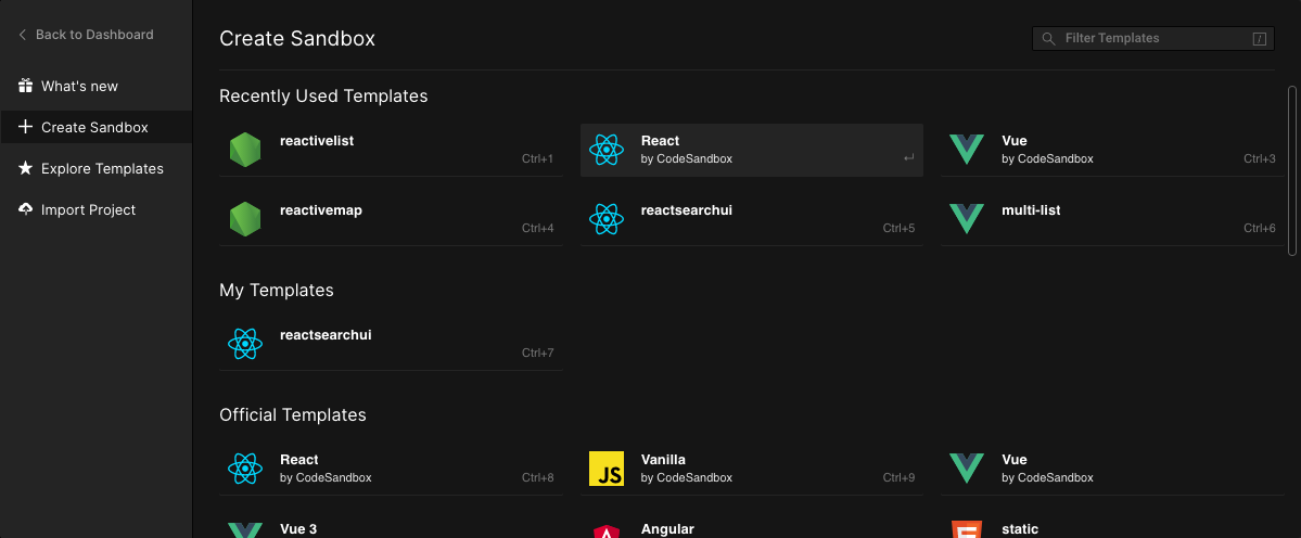
Alternatively, you can go to Codesandbox.io and choose the React Template
Step 1: Install ReactiveSearch
We will fetch and install reactivesearch module using yarn or npm.
yarn add @appbaseio/reactivesearchor
npm install @appbaseio/reactivesearchOR
Alternatively, you can directly add the @appbaseio/reactivesearch dependency to codesandbox.io.
Step 2: Adding the first component
Lets add our first ReactiveSearch component: ReactiveBase, it is a provider component that allows specifying the Elasticsearch index to connect to. Here, we will be using an Elasticsearch instance hosted with appbase.io. Sign up here to create your cluster. If you already have an Elasticsearch cluster setup, you can see this guide on how to connect appbase.io to it.

Caption: For the example that we will build in this tutorial, the app is called good-books-ds and the associated read-only credentials are 04717bb076f7:be54685e-db84-4243-975b-5b32ee241d31. You can browse and export the dataset to JSON or CSV from here.
Note: Clone app option will not work with these credentials here have very narrow access scope (to prevent abuse).
We will update our src/App.js file to add ReactiveBase component.
import React from "react";
import { ReactiveBase } from "@appbaseio/reactivesearch";

function App() {
  return (
    <ReactiveBase
      url="https://appbase-demo-ansible-abxiydt-arc.searchbase.io"
      app="good-books-ds"
      credentials="04717bb076f7:be54685e-db84-4243-975b-5b32ee241d31"
    >
      {/* Our components will go over here */}
      Hello from ReactiveSearch 👋
    </ReactiveBase>
  );
}

export default App;
This is how the app should look after running the yarn start command.
Step 3: Adding Search and Aggregation components
For this app, we will be using SearchBox, MultiList and SingleRange components for searching and filtering on the index. And ResultCard component for showing the search results.
Lets add them within the ReactiveBase component. But before we do that, we will look at the important props for each.
SearchBox
<SearchBox
	componentId="searchbox"
	dataField={[
		{
			"field": "authors",
			"weight": 3
		},
		{
			"field": "authors.autosuggest",
			"weight": 1
		},
		{
			"field": "original_title",
			"weight": 5
		},
		{
			"field": "original_title.autosuggest",
			"weight": 1
		},
	]}
	placeholder="Search for books or authors"
/>
The SearchBox component creates a searchbox UI component that queries on the specified fields with weights as specified by dataField prop. That's all it takes to create a functional search component.
At this point, you should see the following:
MultiList
Next, we will add the MultiList component. As the name suggests, it creates a multiple selection aggregation (aka facet) to filter our search results by.
<MultiList
	componentId="authorsfilter"
	dataField="authors.keyword"
	title="Filter by Authors"
	aggregationSize={5}
/>
Aggregation components like MultiList fire a term type query. You can think of a term query as an exact match query, unlike a search query which involves more nuances. The use of the .keyword suffix for the authors field informs the search engine that the query here is of an exact type.
The aggregationSize prop is used to specify the total aggregations (think buckets) that you want returned based on the dataField value.
Note: The dataField value in MultiList is of string type, since an aggregation is always performed on a single field. In contrast, you may want to search on multiple fields in different ways, so the SearchBox component uses an array of fields instead.
SingleRange
Next, we will add the SingleRange component for creating a ratings based filter for our book search.
<SingleRange
	componentId="ratingsfilter"
	dataField="average_rating"
	title="Filter by Ratings"
	data={[
		{ start: 4, end: 5, label: '4 stars and up' },
		{ start: 3, end: 5, label: '3 stars and up' },
	]}
	defaultValue="4 stars and up"
/>
The SingleRange operates on a numeric datatype field and fires a range query. The data prop of SingleRange allows specifying a [start, end] range and a label associated with it. Using defaultValue, we can preselect a particular option. In this case, we're preselecting all the books that have a rating of 4 stars and up.
At this point, this is how our app should be looking:
We just added completely functional search and aggregation components!
Step 4: Adding Results Component
We just need a results component to display the books that we're searching for. We will use the ReactiveList component with the ResultCard preset.
<ReactiveList
	componentId="results"
	dataField="_score"
	size={6}
	pagination={true}
	react={{
		and: ["searchbox", "authorsfilter", "ratingsfilter"]
	}}
	render={({ data }) => (
		<ReactiveList.ResultCardsWrapper>
		{data.map((item) => (
			<ResultCard key={item._id}>
			<ResultCard.Image src={item.image} />
			<ResultCard.Title
				dangerouslySetInnerHTML={{
				__html: item.original_title
				}}
			/>
			<ResultCard.Description>
				{item.authors + " " + "*".repeat(item.average_rating)}
			</ResultCard.Description>
			</ResultCard>
		))}
		</ReactiveList.ResultCardsWrapper>
	)}
/>
The react prop here specifies that the result should depend on the queries for our searchbox, authors filter and the ratings filter. It's pretty neat!
In the render method, we are using the ResultCard preset to iterate over each result (aka hit) and set the image, title and description values of the card layout.
At this point, you should be seeing our entire app functionally (minus the layouting and styles):
We have built our entire search UI in just 60 lines of code!
Step 5: Adding Layout and Styles
ReactiveSearch doesn't use a layout system internally. If you are using a grid from Bootstrap or Materialize, you can use that. Here, will just make use of CSS Flex.
If you are new to Flex, we recommend a quick read of this article.
With ~6 more lines, our final app layout looks as follows.
<ReactiveBase>
	<div style={{ display: "flex", flexDirection: "row" }}>
		<div style={{ display: "flex", flexDirection: "column", width: "30%", margin: "10px" }}>
			<MultiList/>
			<SingleRange/>
		</div>
		<div style={{ display: "flex", flexDirection: "column", width: "66%" }}>
			<SearchBox />
			<ReactiveList/>
		</div>
	</div>
</ReactiveBase>
Add some margins between the search and result component, and voila! Our final app is ready:
If you like to run this setup locally, clone the ReactiveSearch starter app.


