
DynamicRangeSlider
DynamicRangeSlider creates a numeric range slider UI component. It is used for granular filtering of numeric data.
Example uses:
- filtering products from a price range in an e-commerce shopping experience.
- filtering flights from a range of departure and arrival times.
Note
This component behaves similar to the RangeSlider except that the range is computed dynamically based on actual data.
Usage
Basic Usage
<DynamicRangeSlider
  componentId="DynamicRangeSensor"
  dataField="guests"
/>
While DynamicRangeSlider only requires the above props to be used, it comes with many additional props for pre-selecting range values, setting the step value of the range slider, specifying labels for the range endpoints, whether to display histogram etc.
Usage With All Props
<DynamicRangeSlider
  componentId="DynamicRangeSensor"
  dataField="guests"
  title="Guests"
  defaultValue={(min, max) => (
    {
      "start": min,
      "end": Math.min(min + 5, max)
    }
  )}
  rangeLabels={(min, max) => (
    {
      "start": min + " guest",
      "end": max + " guests"
    }
  )}
  stepValue={1}
  showHistogram={true}
  showFilter={true}
  interval={2}
  react={{
    and: ["CategoryFilter", "SearchFilter"]
  }}
  URLParams={true}
  loader="Loading ..."
/>
Props
-
componentId
Stringunique identifier of the component, can be referenced in other components’reactprop. -
dataField
StringDB data field to be mapped with the component’s UI view.The selected range creates a database query on this field. -
nestedField
String[optional] use to set thenestedmapping field that allows arrays of objects to be indexed in a way that they can be queried independently of each other. Applicable only when dataField is a part ofnestedtype. -
title
String or JSX[optional] title of the component to be shown in the UI. -
defaultValue
Function[optional] a function that acceptsminandmaxrange values as parameters and returns an object representing current selection from the range withstartandendkeys. -
value
Object[optional] controls the current value of the component.It selects the item from the dynamic range (on mount and on update).Use this prop in conjunction withonChangefunction. -
onChange
function[optional] is a callback function which accepts component’s current value as a parameter. It is called when you are using thevalueprop and the component’s value changes. This prop is used to implement the controlled component behavior. -
rangeLabels
Function[optional] a function that acceptsminandmaxrange values as parameters and returns an object representing labels withstartandendkeys. -
showFilter
Boolean[optional] show the selected item as a filter in the selected filters view. Defaults totrue. -
snap
Boolean[optional] makes the slider snap on to points depending on thestepValuewhen the slider is released. Defaults totrue. When set tofalse,stepValueis ignored. -
stepValue
Number[optional] step value specifies the slider stepper. Value should be an integer greater than or equal to1and less thanMath.floor((range.end - range.start) / 2). Defaults to 1. -
tooltipTrigger
String[optional] trigger the tooltip according to the value specified. Can behover,focus,alwaysandnone. Defaults tonone. -
renderTooltipData
Function[optional] customize the rendered tooltip content via a function which receives the tooltip content and expects a JSX or String back. For example:renderTooltipData={data => ( <h5 style={{ color: 'red', textDecoration: 'underline' }}> {data} </h5> )} -
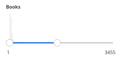
showHistogram
Boolean[optional] whether to display the range histogram or not. Defaults totrue. -
interval
Number[optional] set the histogram bar interval, applicable when showHistogram istrue. Defaults toMath.ceil((props.range.end - props.range.start) / 100) || 1. -
loader
String or JSX[optional] to display an optional loader while fetching the histogram stats. -
URLParams
Boolean[optional] enable creating a URL query string parameter based on the selected range of the slider. This is useful for sharing URLs with the component state. Defaults tofalse.
Demo
Styles
DynamicRangeSlider component supports innerClass prop with the following keys:
titlesliderlabel
Read more about it here.
Extending
DynamicRangeSlider component can be extended to
- customize the look and feel with
className,style. - update the underlying DB query with
customQuery. - connect with external interfaces using
beforeValueChange,onValueChangeandonQueryChange, - filter data using a combined query context via the
reactprop.
<DynamicRangeSlider
  ...
  className="custom-class"
  style={{"paddingBottom": "10px"}}
  customQuery={
    function(value, props) {
      return {
        query: {
            match: {
                data_field: "this is a test"
            }
        }
      }
    }
  }
  onValueChange={
    function(value) {
      console.log("current value: ", value)
      // set the state
      // use the value with other js code
    }
  }
  onQueryChange={
    function(prevQuery, nextQuery) {
      // use the query with other js code
      console.log('prevQuery', prevQuery);
      console.log('nextQuery', nextQuery);
    }
  }
  beforeValueChange={
    function(value) {
      // called before the value is set
      // returns a promise
      return new Promise((resolve, reject) => {
        // update state or component props
        resolve()
        // or reject()
      })
    }
  }
  react={{
    "and": ["ListSensor"]
  }}
/>- className
StringCSS class to be injected on the component container. - style
ObjectCSS styles to be applied to the DynamicRangeSlider component. - customQuery
Functiontakes value and props as parameters and returns the data query to be applied to the component, as defined in Elasticsearch Query DSL.Note:customQuery is called on value changes in the DynamicRangeSlider component as long as the component is a part ofreactdependency of at least one other component. - beforeValueChange
Functionis a callback function which accepts component’s future value as a parameter and returns a promise. It is called everytime before a component’s value changes. The promise, if and when resolved, triggers the execution of the component’s query and if rejected, kills the query execution. This method can act as a gatekeeper for query execution, since it only executes the query after the provided promise has been resolved. - onValueChange
Functionis a callback function which accepts component’s current value as a parameter. It is called everytime the component’s value changes. This prop is handy in cases where you want to generate a side-effect on value selection. For example: You want to show a pop-up modal with the valid discount coupon code when a user selects a particular range in a DynamicRangeSlider. - onQueryChange
Functionis a callback function which accepts component’s prevQuery and nextQuery as parameters. It is called everytime the component’s query changes. This prop is handy in cases where you want to generate a side-effect whenever the component’s query would change. -
react
Objectspecify dependent components to reactively update DynamicRangeSlider’s data view.-
key
Stringone ofand,or,notdefines the combining clause.- and clause implies that the results will be filtered by matches from all of the associated component states.
- or clause implies that the results will be filtered by matches from at least one of the associated component states.
- not clause implies that the results will be filtered by an inverse match of the associated component states.
-
value
String or Array or ObjectStringis used for specifying a single component by itscomponentId.Arrayis used for specifying multiple components by theircomponentId.Objectis used for nesting other key clauses.
-
Examples
See more stories for DynamicRangeSlider on playground.