
NestedMultiList
NestedMultiList creates a nested multiple selection list UI component. It is used for filtering items by a hierarchy of categories.
Example uses:
- show a two-level or three-level category list for an e-commerce search experience.
- building an e-learning system with multiple courses based selections.
Usage
Basic Usage
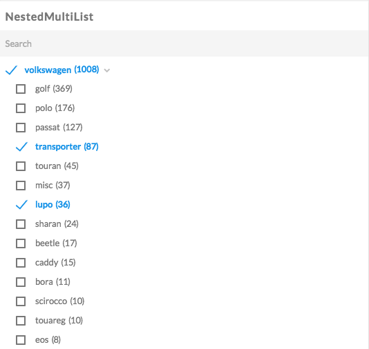
<NestedMultiList
  componentId="CarCategorySensor"
  dataField={["brand.raw", "model.raw"]}
/>
Usage With All Props
<NestedMultiList
  componentId="CarCategorySensor"
  dataField={["brand.raw", "model.raw"]}
  title="List of Brand > Model"
  size={100}
  sortBy="asc"
  defaultSelected={["ford", "galaxy"]}
  showCount={true}
  showSearch={false}
  placeholder="Search"
  loader="Fetching cars.."
  react={{
    and: ["CategoryFilter", "SearchFilter"]
  }}
  showFilter={true}
  filterLabel="Cars filter"
  URLParams={false}
/>
Props
- componentId
String
unique identifier of the component, can be referenced in other components’reactprop. - dataField
Array
data field(s) to be mapped with the component’s UI view. A nested list component supports multiple fields passed as an Array denoting the order of nesting. - title
String or JSX[optional]
title of the component to be shown in the UI. - size
Number[optional]
control how many items to display in the List. Defaults to 100. - sortBy
String[optional]
sort the list items by one ofcount,asc, ordesc. Defaults tocount, which sorts the list by the frequency of count value, most first. - defaultSelected
Array[optional]
pre-select nested list item(s). Accepts anArrayobject containing the hierarchy of items to be selected. It is important that the passed value(s) exactly match the field value(s) as stored in the DB. - showCount
Boolean[optional]
show a count of the number of occurrences besides each list item. Defaults totrue. - showSearch
Boolean[optional]
whether to show a searchbox to filter the list items locally. Defaults to true. - placeholder
String[optional]
placeholder to be displayed in the searchbox, only applicable when theshowSearchprop is set totrue. When applicable, the default placeholder value is set to “Search”. - loader
String or JSX[optional]
display text while the data is being fetched, acceptsStringorJSXmarkup. - showFilter
Boolean[optional]
show as filter when a value is selected in a global selected filters view. Defaults totrue. - filterLabel
String[optional]
An optional label to display for the component in the global selected filters view. This is only applicable ifshowFilteris enabled. Default value used here iscomponentId. - URLParams
Boolean[optional]
enable creating a URL query string parameter based on the selected value of the list. This is useful for sharing URLs with the component state. Defaults tofalse.
Note
A NestedMultiList component’s props are exactly like a NestedList component except for the
defaultSelectedprop which can take an Array with multiple selections like{["Car", ["ford", "galaxy"]]}.
Syntax
Styles
All reactivebase components are rbc namespaced.
Extending
NestedMultiList component can be extended to
- customize the look and feel with
className,style, - update the underlying DB query with
customQuery, - connect with external interfaces using
beforeValueChange,onValueChangeandonQueryChange, - filter data using a combined query context via the
reactprop.
<NestedMultiList
  ...
  className="custom-class"
  style={{"paddingBottom": "10px"}}
  customQuery={
    function(value, props) {
      return {
        query: {
          match: {
            data_field: "this is a test"
          }
        }
      }
    }
  }
  beforeValueChange={
    function(value) {
      // called before the value is set
      // returns a promise
      return new Promise((resolve, reject) => {
        // update state or component props
        resolve()
        // or reject()
      })
    }
  }
  onValueChange={
    function(value) {
      console.log("current value: ", value)
      // set the state
      // use the value with other js code
    }
  }
  onQueryChange={
    function(prevQuery, nextQuery) {
      // use the query with other js code
      console.log('prevQuery', prevQuery);
      console.log('nextQuery', nextQuery);
    }
  }
  react={{
    "and": ["PriceFilter"]
  }}
/>- className
String
CSS class to be injected on the component container. - style
Object
CSS styles to be applied to the NestedMultiList component. - customQuery
Function
takes value and props as parameters and returns the data query to be applied to the component, as defined in Elasticsearch Query DSL.Note:customQuery is called on value changes in the NestedMultiList component as long as the component is a part ofreactdependency of at least one other component. - beforeValueChange
Function
is a callback function which accepts component’s future value as a parameter and returns a promise. It is called every time before a component’s value changes. The promise, if and when resolved, triggers the execution of the component’s query and if rejected, kills the query execution. This method can act as a gatekeeper for query execution, since it only executes the query after the provided promise has been resolved. - onValueChange
Function
is a callback function which accepts component’s current value as a parameter. It is called every time the component’s value changes. This prop is handy in cases where you want to generate a side-effect on value selection. For example: You want to show a pop-up modal with the valid discount coupon code when a user selects a product in a NestedMultiList. - onQueryChange
Function
is a callback function which accepts component’s prevQuery and nextQuery as parameters. It is called everytime the component’s query changes. This prop is handy in cases where you want to generate a side-effect whenever the component’s query would change. -
react
Object
specify dependent components to reactively update NestedMultiList’s data view.-
key
String
one ofand,or,notdefines the combining clause.- and clause implies that the results will be filtered by matches from all of the associated component states.
- or clause implies that the results will be filtered by matches from at least one of the associated component states.
- not clause implies that the results will be filtered by an inverse match of the associated component states.
-
value
String or Array or ObjectStringis used for specifying a single component by itscomponentId.Arrayis used for specifying multiple components by theircomponentId.Objectis used for nesting other key clauses.
-