
SingleDropdownList
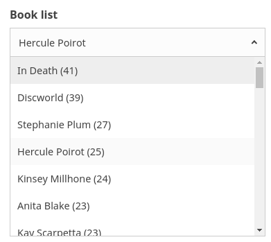
SingleDropdownList creates a dropdown list based single select UI component. It is used for filtering results based on the current selection from a list of items.
Note
This component is exactly like the SingleList component except the UI is based on a dropdown, ideal for showing additional UI filters while conserving screen space.
Example uses:
- select a category from a list of categories for filtering e-commerce search results.
- filtering restaurants by a cuisine choice.
Usage
Basic Usage
<template>
    <single-dropdown-list
        componentId="CitySensor"
        dataField="group.group_city.raw"
        title="Cities"
    />
</template>
Usage With All Props
<single-dropdown-list
  componentId="CitySensor"
  dataField="group.group_city.raw"
  title="Cities"
  sortBy="count"
  defaultSelected="London"
  placeholder="Search City"
  selectAllLabel="All Cities"
  filterLabel="City"
  :showCount="true"
  :react="{ and: ['CategoryFilter', 'SearchFilter'] }"
  :size="100"
  :showFilter="true"
  :URLParams="false"
/>
Props
- componentId
String
unique identifier of the component, can be referenced in other components’reactprop. - dataField
String
data field to be connected to the component’s UI view. This field is used for doing an aggregation and returns the result. We’re using a.rawmultifield here. You can use a field of typekeywordornot_analyzeddepending on your Elasticsearch cluster. - nestedField
String[optional]
use to set thenestedmapping field that allows arrays of objects to be indexed in a way that they can be queried independently of each other. Applicable only when dataField is a part ofnestedtype. - title
String or JSX[optional]
title of the component to be shown in the UI. - size
Number[optional]
control how many items to display in the List. Defaults to 100. - sortBy
String[optional]
property that decides on how to sort the list items, accepts one ofcount,ascordescas valid values.countsorts the list based on the count occurences, with highest value at the top.ascsorts the list in the ascending order of the list item (Alphabetical).descsorts the list in the descending order of the term. Defaulted tocount. - defaultSelected
string[optional]
default selected value pre-selects an option from the list. - showCount
Boolean[optional]
show count of number of occurences besides an item. Defaults totrue. - showSearch
Boolean[optional]
whether to show a searchbox to filter the list items locally. Defaults to false. -
renderItem
Function|scoped-slot[optional]
customize the rendered list via a function or scoped-slot which receives the item label, count and isChecked & expects a JSX or String back. For example:renderItem={({ label, count }) => ( <div> {label} <span style={{ marginLeft: 5, color: 'dodgerblue' }}> {count} </span> </div> )}or
    <template slot="renderItem" scoped-slot="{ label, count }">
        <div>
            {{label}}
            <span :style="{ marginLeft: 5, color: 'dodgerblue' }">
                {{count}}
            </span>
        </div>
    </template>
- renderError
String|Function|scoped-slot[optional] can be used to render an error message in case of any error.
    renderError={error => (
            <div>
                Something went wrong!<br/>Error details<br/>{error}
            </div>
        )
    }
or
   <template slot="renderError" scoped-slot="error">
        <div>
            Something went wrong!<br/>Error details<br/>{{ error }}
        </div>
    </template>
- showMissing
Boolean[optional]
defaults tofalse. When set totrueit also retrives the aggregations for missing fields under the label specified bymissingLabel. - missingLabel
String[optional]
defaults toN/A. Specify a custom label to show whenshowMissingis set totrue. - placeholder
String[optional]
placeholder to be displayed in the dropdown searchbox. - selectAllLabel
String[optional]
if provided, shows an extra option to select all the options in the list with the provided string value. - showFilter
Boolean[optional]
show as filter when a value is selected in a global selected filters view. Defaults totrue. - filterLabel
String[optional]
An optional label to display for the component in the global selected filters view. This is only applicable ifshowFilteris enabled. Default value used here iscomponentId. - URLParams
Boolean[optional]
enable creating a URL query string parameter based on the selected value of the list. This is useful for sharing URLs with the component state. Defaults tofalse. - showLoadMore
Boolean[optional]
defaults tofalseand works only with elasticsearch >= 6 since it uses composite aggregations. This adds a “Load More” button to load the aggs on demand combined with thesizeprop. Composite aggregations are in beta and this is an experimental API which might change in a future release.
Demo
Styles
SingleDropdownList component supports innerClass prop with the following keys:
titleselectlisticoncount
Read more about it here.
Extending
SingleDropdownList component can be extended to
- customize the look and feel with
className, - update the underlying DB query with
customQuery, - connect with external interfaces using
beforeValueChange,valueChangeandqueryChange, - specify how options should be filtered or updated using
reactprop.
<single-dropdown-list
  ...
  className="custom-class"
  :customQuery=`
    function(value, props) {
      return {
        query: {
            match: {
                data_field: "this is a test"
            }
        }
      }
    }`
  :beforeValueChange=`
    function(value) {
      // called before the value is set
      // returns a promise
      return new Promise((resolve, reject) => {
        // update state or component props
        resolve()
        // or reject()
      })
    }`
    @valueChange=`
        function(value) {
        console.log("current value: ", value)
        // set the state
        // use the value with other js code
    }`
    @queryChange=`
        function(prevQuery, nextQuery) {
        // use the query with other js code
        console.log('prevQuery', prevQuery);
        console.log('nextQuery', nextQuery);
        }`
    // specify how and which options are filtered using `react` prop.
    :react=`{
        "and": ["pricingFilter", "dateFilter"],
        "or": ["searchFilter"]
    }`
/>
- className
String
CSS class to be injected on the component container. - customQuery
Functiontakes value and props as parameters and returns the data query to be applied to the component, as defined in Elasticsearch Query DSL.Note:customQuery is called on value changes in the SingleDropdownList component as long as the component is a part ofreactdependency of at least one other component. - defaultQuery
Functiontakes value and props as parameters and returns the data query to be applied to the source component, as defined in Elasticsearch Query DSL.Note:defaultQuery doesn’t get leaked to other components. - beforeValueChange
Function
is a callback function which accepts component’s future value as a parameter and returns a promise. It is called everytime before a component’s value changes. The promise, if and when resolved, triggers the execution of the component’s query and if rejected, kills the query execution. This method can act as a gatekeeper for query execution, since it only executes the query after the provided promise has been resolved. - transformData
Function[optional]
allows transforming the data to render inside the list. You can change the order, remove, or add items, tranform their values with this method. It provides the data as param which is an array of objects of shape{ key: <string>, doc_count: <number> }and expects you to return the array of objects of same shape. -
react
Object
specify dependent components to reactively update SingleDropdownList’s options.-
key
String
one ofand,or,notdefines the combining clause.- and clause implies that the results will be filtered by matches from all of the associated component states.
- or clause implies that the results will be filtered by matches from at least one of the associated component states.
- not clause implies that the results will be filtered by an inverse match of the associated component states.
-
value
String or Array or ObjectStringis used for specifying a single component by itscomponentId.Arrayis used for specifying multiple components by theircomponentId.Objectis used for nesting other key clauses.
-
Events
-
queryChange
is an event which accepts component’s prevQuery and nextQuery as parameters. It is called everytime the component’s query changes. This event is handy in cases where you want to generate a side-effect whenever the component’s query would change. -
valueChange
is an event which accepts component’s current value as a parameter. It is called everytime the component’s value changes. This event is handy in cases where you want to generate a side-effect on value selection. For example: You want to show a pop-up modal with the valid discount coupon code when a list item is selected in a “Discounted Price” SingleList. -
error gets triggered in case of an error and provides the
errorobject, which can be used for debugging or giving feedback to the user if needed.