
DynamicRangeSlider
DynamicRangeSlider creates a numeric range slider UI component. It is used for granular filtering of numeric data.
Example uses:
- filtering products from a price range in an e-commerce shopping experience.
- filtering flights from a range of departure and arrival times.
Usage
Basic Usage
<template>
<dynamic-range-slider
dataField="books_count"
componentId="BookSensor"
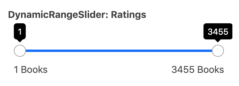
title="DynamicRangeSlider: Ratings"
/>
</template>
While DynamicRangeSlider only requires the above props to be used, it comes with many additional props for pre-setting default range values, setting the step value of the range slider, specifying labels for the range endpoints, etc.
Usage With All Props
<template>
    <dynamic-range-slider
      dataField="books_count"
      componentId="BookSensor"
      title="DynamicRangeSlider: Ratings"
      :defaultSelected="function(min, max){
          return {
              start: min + 1000,
              end: max - 1000,
          }
      }"
      :rangeLabels="function(min, max){
          return {
              start: min + ' Books',
              end: max + ' Books',
          }
      }"
      :showFilter="true"
      :URLParams="false"
    />
</template>
Props
- componentId
String
unique identifier of the component, can be referenced in other components’reactprop. - dataField
String
DB data field to be mapped with the component’s UI view. The selected range creates a database query on this field. - nestedField
String[optional]
use to set thenestedmapping field that allows arrays of objects to be indexed in a way that they can be queried independently of each other. Applicable only when dataField is a part ofnestedtype. - title
String or JSX[optional]
title of the component to be shown in the UI. - defaultSelected
Function[optional]
a function that acceptsminandmaxrange values as parameters and returns an object representing current selection from the range withstartandendkeys. - rangeLabels
Function[optional]
a function that acceptsminandmaxrange values as parameters and returns an object representing labels withstartandendkeys. - showFilter
Boolean[optional]
show the selected item as a filter in the selected filters view. Defaults totrue. - URLParams
Boolean[optional]
enable creating a URL query string parameter based on the selected value of the list. This is useful for sharing URLs with the component state. Defaults tofalse.
Demo
Styles
DynamicRangeSlider component supports innerClass prop with the following keys:
title
Read more about it here.
Extending
DynamicRangeSlider component can be extended to
- customize the look and feel with
className,style, - update the underlying DB query with
customQuery, - connect with external interfaces using
beforeValueChange,valueChangeandqueryChange.
<dynamic-range-slider
  ...
  className="custom-class"
  :customQuery=`
    function(value, props) {
      return {
        query: {
            match: {
                data_field: "this is a test"
            }
        }
      }
    }
  `
  :beforeValueChange=`
    function(value) {
      // called before the value is set
      // returns a promise
      return new Promise((resolve, reject) => {
        // update state or component props
        resolve()
        // or reject()
      })
    }`
  @valueChange=`
    function(value) {
      console.log("current value: ", value)
      // set the state
      // use the value with other js code
    }`
  @queryChange=`
    function(prevQuery, nextQuery) {
      // use the query with other js code
      console.log('prevQuery', prevQuery);
      console.log('nextQuery', nextQuery);
    }`
/>
- className
String
CSS class to be injected on the component container. - customQuery
Functiontakes value and props as parameters and returns the data query to be applied to the component, as defined in Elasticsearch Query DSL.Note:customQuery is called on value changes in the DynamicRangeSlider component as long as the component is a part ofreactdependency of at least one other component. - beforeValueChange
Function
is a callback function which accepts component’s future value as a parameter and returns a promise. It is called everytime before a component’s value changes. The promise, if and when resolved, triggers the execution of the component’s query and if rejected, kills the query execution. This method can act as a gatekeeper for query execution, since it only executes the query after the provided promise has been resolved.
Events
-
queryChange
is an event which accepts component’s prevQuery and nextQuery as parameters. It is called everytime the component’s query changes. This event is handy in cases where you want to generate a side-effect whenever the component’s query would change. -
valueChange
is an event which accepts component’s current value as a parameter. It is called everytime the component’s value changes. This event is handy in cases where you want to generate a side-effect on value selection.For example: You want to show a pop-up modal with the valid discount coupon code when some range is selected in a “Discounted Price” DynamicRangeSlider.