
ResultList
ResultList creates a result list UI component to display results in a list layout, suited for data that needs a compact display.
Example uses:
- showing e-commerce search listings.
- showing filtered hotel booking results.
Note
An alternative layout to ResultList is a ResultCard, which displays result data in a card layout.
Usage
Basic Usage
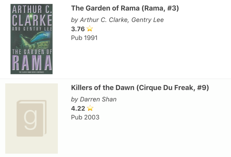
<template>
    <result-list
        componentId="SearchResult"
        dataField="original_title.raw"
        :from="0"
        :size="5"
        :renderData="booksList"
    />
</template>
<script>
    methods: {
        booksList(data) {
            return {
                title: data.original_title,
                image: data.image,
                description: `
                    <div>
                        <p>
                            <em>by ${data.authors}</em>
                        </p>
                        <p>
                            <b>${data.average_rating}</b> ⭐
                        </p>
                        <span>Pub ${data.original_publication_year}</span>
                    </div>
                `,
            };
        }
    }
</script>
Usage With All Props
<result-list
  componentId="SearchResult"
  dataField="original_title.raw"
  paginationAt="bottom"
  :renderData="booksList"
  loader="Loading Books.."
  sortBy="desc"
  :stream="true"
  :pagination="false"
  :pages="5"
  :size="10"
  :showResultStats="true"
  :react=`{
    and: ["BookRatings", "SearchSensor"]
  }`
/>
Props
-
componentId
String
unique identifier of the component, can be referenced in other components’reactprop. -
dataField
String
data field to be connected to the component’s UI view. It is useful for providing a sorting context i.e. results would be sorted based on thedataField. -
excludeFields
String Array[optional]
fields to be excluded in search results. -
includeFields
String Array[optional]
fields to be included in search results. -
stream
Boolean[optional]
whether to stream new result updates in the UI. Defaults tofalse.stream: trueis appended to the streaming hit objects, which can be used to selectively react to streaming changes (eg. showing fade in animation on new streaming hits, Twitter/Facebook like streams, showing the count of new feed items available like 2 New Tweets) -
pagination
Boolean[optional]
pagination <> infinite scroll switcher. Defaults tofalse, i.e. an infinite scroll based view. When set totrue, a pagination based list view with page numbers will appear. -
paginationAt
String[optional]
Determines the position where to show the pagination, only applicable when pagination prop is set totrue. Accepts one oftop,bottomorbothas valid values. Defaults tobottom. -
pages
Number[optional]
number of user selectable pages to be displayed when pagination is enabled. Defaults to 5. -
sortBy
String[optional]
sort the results by eitherascordescorder. It is an alternative tosortOptions, both can’t be used together. -
sortOptions
Object Array[optional]
an alternative to thesortByprop,sortOptionscreates a sorting view in the resultlist component’s UI. Each array element is an object that takes three keys:label- label to be displayed in the UI.dataField- data field to use for applying the sorting criteria on.sortBy- specified as eitherascordesc.
-
size
Number[optional]
number of results to show per view. Defaults to 10. -
loader
String|scoped-slot[optional]
display to show the user while the data is loading, acceptsStringorJSXmarkup. -
showResultStats
Boolean[optional]
whether to show result stats in the form of results found and time taken. Defaults totrue. -
react
Object[optional]
a dependency object defining how this component should react based on the state changes in the sensor components. -
URLParams
Boolean[optional]
when set adds the current page number to the url. Only works whenpaginationis enabled. -
renderData
Function|scoped-slot[optional]
returns a list element object to be rendered based on theresdata object. This callback function prop is called for each data item rendered in the ResultList component’s view.<result-list :renderData="function(data){ return { title: data.original_title, image: data.image, description: ` <div> <p> <em>by ${data.authors}</em> </p> <p> <b>${data.average_rating}</b> ⭐ </p> <span>Pub ${data.original_publication_year}</span> </div> `, containerProps:{ on: { mouseenter: () => console.log('😄'), mouseleave: () => console.log('🚀') } } }; }" /> -
renderResultStats
Function|scoped-slot[optional] renders custom result stats using a callback function that takesstatsobject as parameter and expects it to return a string or html.statsobject contains following propertiestotalResults- Total number of results foundtotalPages- Total number of pages found based on current page sizecurrentPage- Current page number for which data is being rendereddisplayedResults- Number of results displayed in current view-
time- Time taken to find total results:renderResultStats=" function(stats){ return ( `Showing ${stats.displayedResults} of total ${stats.totalResults} in ${stats.time} ms` ) } "
-
defaultQuery
Function[optional]
applies a default query to the result component. This query will be run when no other components are being watched (via React prop), as well as in conjunction with the query generated from the React prop. The function should return a query. -
onNoResults
String[optional]
show custom message or component when no results founds.
Demo
Styles
resultlist component supports innerClass prop with the following keys:
resultsInfosortOptionsresultStatsnoResultsbuttonpaginationactivelistpoweredBy
Read more about it here.
Extending
resultlist component can be extended to
- customize the look and feel with
className, - render individual result data items using
renderData, - connect with external interfaces using
queryChange.
<resultlist
  ...
  className="custom-class"
  :renderData=`
    function({ item }) {
      return(
        <div>
          { item.data }
        </div>
      )
    }
  `
  @queryChange=`
    function(prevQuery, nextQuery) {
      // use the query with other js code
      console.log('prevQuery', prevQuery);
      console.log('nextQuery', nextQuery);
    }
  `
/>
- className
String
CSS class to be injected on the component container. - renderData
Function|scoped-slot[optional]
a callback function or scoped-slot where user can define how to render the view based on the data changes.
Note
The
streamResultsparameter will be[]unlessstreamprop is set totrue. Check the handling streaming guide for more info.
Events
-
queryChange
is an event which accepts component’s prevQuery and nextQuery as parameters. It is called everytime the component’s query changes. This event is handy in cases where you want to generate a side-effect whenever the component’s query would change. -
pageChange
called when the current page is changed. If not defined,windowwill be scrolled to the top of the page. -
pageClick accepts a function which is invoked with the updated page value when a pagination button is clicked. For example if ‘Next’ is clicked with the current page number as ‘1’, you would receive the value ‘2’ as the function parameter.
-
data
Function[optional] gets triggered after data changes, which returns an object with these properties:results,streamResults,loadMore,base&triggerClickAnalytics. -
resultStats
Function[optional] gets triggered after stats changes, which returns an object with these properties:totalResults- Total number of results foundtotalPages- Total number of pages found based on current page sizecurrentPage- Current page number for which data is being rendereddisplayedResults- Number of results displayed in current viewtime- Time taken to find total results
Note:
The fundamental difference between
pageChangeandpageClickis thatpageClickis only called on a manual interaction with the pagination buttons, whereas,pageChangewould also be invoked if some other side effects caused the results to update which includes updating filters, queries or changing pages. The behaviour of these two may change in the future versions as we come up with a better API.
- error invoked when query listener throws any error