
ToggleButton
ToggleButton creates a toggle button UI component that is connected to a database field. It is used for filtering results based on a fixed set of toggle-able options.
Example uses:
- filter movies by ratings between 1 and 5,
- display restaurants that accept delivery and are open now,
- show flight tickets by one way, round trip and multi-city options.
Usage
Basic Usage
<ToggleButton
  componentId="MeetupTops"
  dataField="group_topics.topic_name.raw"
  data={
    [{"label": "Social",   "value": "Social"},
     {"label": "Travel",   "value": "Travel"},
     {"label": "Outdoors", "value": "Outdoors"}]
  }
/>
Usage With All Props
<ToggleButton
  componentId="MeetupTops"
  dataField="group_topics.topic_name.raw"
  data={
    [{"label": "Social",   "value": "Social"},
     {"label": "Travel",   "value": "Travel"},
     {"label": "Outdoors", "value": "Outdoors"}]
  }
  title="Meetups"
  defaultValue={["Social"]}
  multiSelect={true}
  showFilter={true}
  filterLabel="City"
  URLParams={false}
/>
Props
- componentId
Stringunique identifier of the component, can be referenced in other components’reactprop. - dataField
Stringdata field to be connected to the component’s UI view. - data
Object Arraycollection of UIlabelswith associatedvalueto be matched against the database field. - nestedField
String[optional] use to set thenestedmapping field that allows arrays of objects to be indexed in a way that they can be queried independently of each other. Applicable only when dataField is a part ofnestedtype. - title
StringorJSX[optional] title of the component to be shown in the UI. - defaultValue
StringorArray[optional] an array of default selected label(s) to pre-select one or more buttons. - value
String Array[optional] controls the current value of the component. It selects the label (on mount and on update). Use this prop in conjunction withonChangefunction. - multiSelect
Boolean[optional] whether multiple buttons can be selected, defaults to true. When set to false, only one button can be selected. - showFilter
Boolean[optional] show as filter when a value is selected in a global selected filters view. Defaults totrue. - filterLabel
String[optional] An optional label to display for the component in the global selected filters view. This is only applicable ifshowFilteris enabled. Default value used here iscomponentId. - URLParams
Boolean[optional] enable creating a URL query string parameter based on the selected value of the list. This is useful for sharing URLs with the component state. Defaults tofalse. - onChange
function[optional] is a callback function which accepts component’s current value as a parameter. It is called when you are using thevalueprop and the component’s value changes. This prop is used to implement the controlled component behavior.
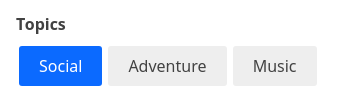
Demo
Styles
ToggleButton component supports innerClass prop with the following keys:
titlebutton
Read more about it here.
Extending
ToggleButton component can be extended to
- customize the look and feel with
className,style, - update the underlying DB query with
customQuery, - connect with external interfaces using
beforeValueChange,onValueChangeandonQueryChange.
<ToggleButton
  ...
  className="custom-class"
  style={{"paddingBottom": "10px"}}
  customQuery={
    function(value, props) {
      return {
        query: {
          match: {
            data_field: "this is a test"
          }
        }
      }
    }
  }
  beforeValueChange={
    function(value) {
      // called before the value is set
      // returns a promise
      return new Promise((resolve, reject) => {
        // update state or component props
        resolve()
        // or reject()
      })
    }
  }
  onValueChange={
    function(value) {
      console.log("current value: ", value)
      // set the state
      // use the value with other js code
    }
  }
  onQueryChange={
    function(prevQuery, nextQuery) {
      // use the query with other js code
      console.log('prevQuery', prevQuery);
      console.log('nextQuery', nextQuery);
    }
  }
/>- className
StringCSS class to be injected on the component container. - style
ObjectCSS styles to be applied to the ToggleButton component. - customQuery
Functiontakes value and props as parameters and returns the data query to be applied to the component, as defined in Elasticsearch Query DSL.Note:customQuery is called on value changes in the ToggleButton component as long as the component is a part ofreactdependency of at least one other component. - beforeValueChange
Functionis a callback function which accepts component’s future value as a parameter and returns a promise. It is called everytime before a component’s value changes. The promise, if and when resolved, triggers the execution of the component’s query and if rejected, kills the query execution. This method can act as a gatekeeper for query execution, since it only executes the query after the provided promise has been resolved. - onValueChange
Functionis a callback function which accepts component’s current value as a parameter. It is called everytime the component’s value changes. This prop is handy in cases where you want to generate a side-effect on value selection. For example: You want to show a pop-up modal with the valid discount coupon code(s) when button(s) is/are selected in a “Discounted Price” ToggleButton. - onQueryChange
Functionis a callback function which accepts component’s prevQuery and nextQuery as parameters. It is called everytime the component’s query changes. This prop is handy in cases where you want to generate a side-effect whenever the component’s query would change.